next up previous contents
Next: Discussion Up: The Role of Chance.2 Previous: Testing for Significance.

Activity Wave Diagrams

Whereas the Activity and Mean Activity measures produce a summary figure for a whole population of genotypes at time t, activity wave diagrams plot the success of every genotype in the population at every stage of the run [Bedau & Brown 97]. They are therefore a useful visualisation technique for competition between genotypes, and the shape of an individual wave can also suggest the level of adaptive value of the corresponding genotype relative to its competitors (see Section 5.1.1).

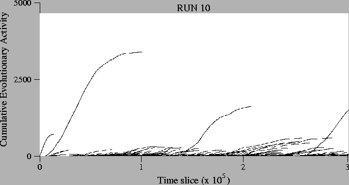
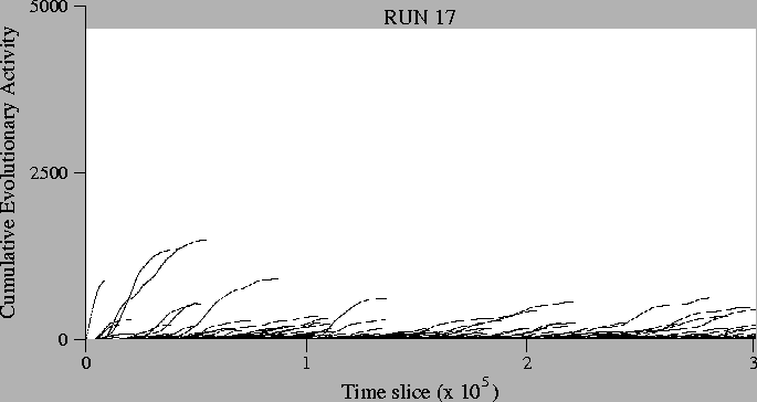
The activity wave diagrams for most of the runs looked surprisingly different, although it is hard to quantify these differences (the Activity and Mean Activity measures do quantify some aspects of them, but no single measure captures all of the important information that the diagrams can tell us). Example activity wave diagrams (for runs 10 and 17) are presented in Figure 6.8.


Figure: Activity Wave Diagram, Runs 10 (left) and 17 (right).

\rotatebox{270}{
\resizebox{!}{\linewidth}{\includegraphics{graphs/alife6/me13.waves10_annotated.ps}}}


\rotatebox{270}{
\resizebox{!}{\linewidth}{\includegraphics{graphs/alife6/me13.waves17_annotated.ps}}}


One way in which the activity wave diagrams can be very useful is in evaluating the effectiveness of different measures of evolution at highlighting the important adaptive events during a run. Cumulative Activity usually seems to give a better reflection of the wave diagram than does Mean Cumulative Activity. This is possibly because the latter measure is defined as Activity divided by Diversity, but diversity, by its very nature, does not take account of the concentrations of different genotypes, but merely their presence.


next up previous contents
Next: Discussion Up: The Role of Chance.2 Previous: Testing for Significance.
Tim Taylor
1999-05-29