One of the points of interest in the population size graph, as mentioned in the previous section, is the fact that the limit on the number of cells in the population imposed by the parameter max_cells_per_process was never reached. This suggests that the population size was instead being limited by the amount of energy available in the environment. Figure 5.3 also shows a very high frequency oscillation in the population size, convolved with the lower frequency trends. This is consistent with the explanation offered in the previous section, that the birth and death cycle in the population was highly synchronised, producing a pattern of growth and decline determined by a ceiling population size related to the total amount of energy available in the environment.
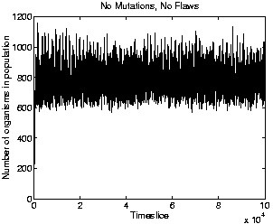
To check whether the energy available in the environment really did impose a population ceiling lower than that specified by the parameter max_cells_per_process, a number of test runs were conducted. The only difference between the runs was the number used to seed the random number generator at the start of each one. Nine runs were conducted. In these runs, mutations and flaws were switched off, so that no evolution occurred. This allows us to see how the population size varies in a population of the ancestor programs, divorced from any effects due to competition from newly evolved programs. The graph of population size for one of these runs (which all lasted for 100,000 time slices), is shown in Figure 5.9. The figure clearly shows that the maximum population size achievable in practice is indeed well below the limit of 2500 set by max_cells_per_process; in fact, it is less than half of this value. Even with mutations and flaws switched off, slight differences arose between the different runs because, at each time slice, the programs in the population are processed in random order. However, the corresponding graphs for the other runs were all very similar; the maximum population size reached at any point in any of the runs was 1280 individuals.
 |
Looking at the larger trends in the population size, we can see that they seem to be negatively correlated to the trends in replication period (Figure 5.4). This observation is consistent with the earlier suggestion that the programs are getting longer because they are collecting more energy. The more energy each program stores on average, the less is available in the environment for use by other programs, so the lower the maximum population size achievable. We will look into the question of whether the programs were evolving to collect more energy in Sections 5.2.7 and 5.2.8.
Looking at the diversity of the population throughout the run (the number of different types of program at any given point), we see that it is generally very low (Figure 5.5). Examination of the activity wave diagram (Figure 5.13, discussed in Section 5.2.6) reveals that there there is usually just one dominant genotype in the population at any given time (except at the very beginning of the run), and the concentration of other varieties is low.
There are interesting spikes in the diversity graph, one at roughly time 473,000, and another at 960,000. These spikes immediately precede dips in the population size (Figure 5.3). Inspection of the raw data files produced during the run reveals that these spikes correspond to the appearance of a number of longer genotypes, of lengths mostly in the region of 500-600 bits. None of these was ever represented by more than a single program in the population, suggesting that these were not viable self-replicators. As the numbers of these programs never exceeded the threshold defined by the system parameter species_count_threshold_for_recording, they do not show up in Figure 5.2 (as discussed in Section 5.1.1). As no further data was recorded for these programs, not much more can be said about them. However, it is reasonable to guess that they stored large amounts of energy, leading to the observed drop in population size.
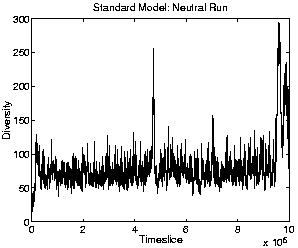
To get an idea of the extent to which the diversity of the population is due specifically to the adaptive success of the individual genotypes rather than to other non-adaptive dynamics in the system, we can look at the diversity graph of the neutral shadow. (Recall that the neutral shadow replays the exact sequence of births and deaths recorded in the real run, but acts upon random individuals. The population size in the neutral shadow is therefore always identical to the real run.) The neutral diversity graph is shown in Figure 5.10. This graph shows that the diversity in the neutral shadow was considerably higher than in the standard run, which suggests that the low diversity observed in the standard run was indeed due to the adaptive success of one or a small number of genotypes at outcompeting other varieties.